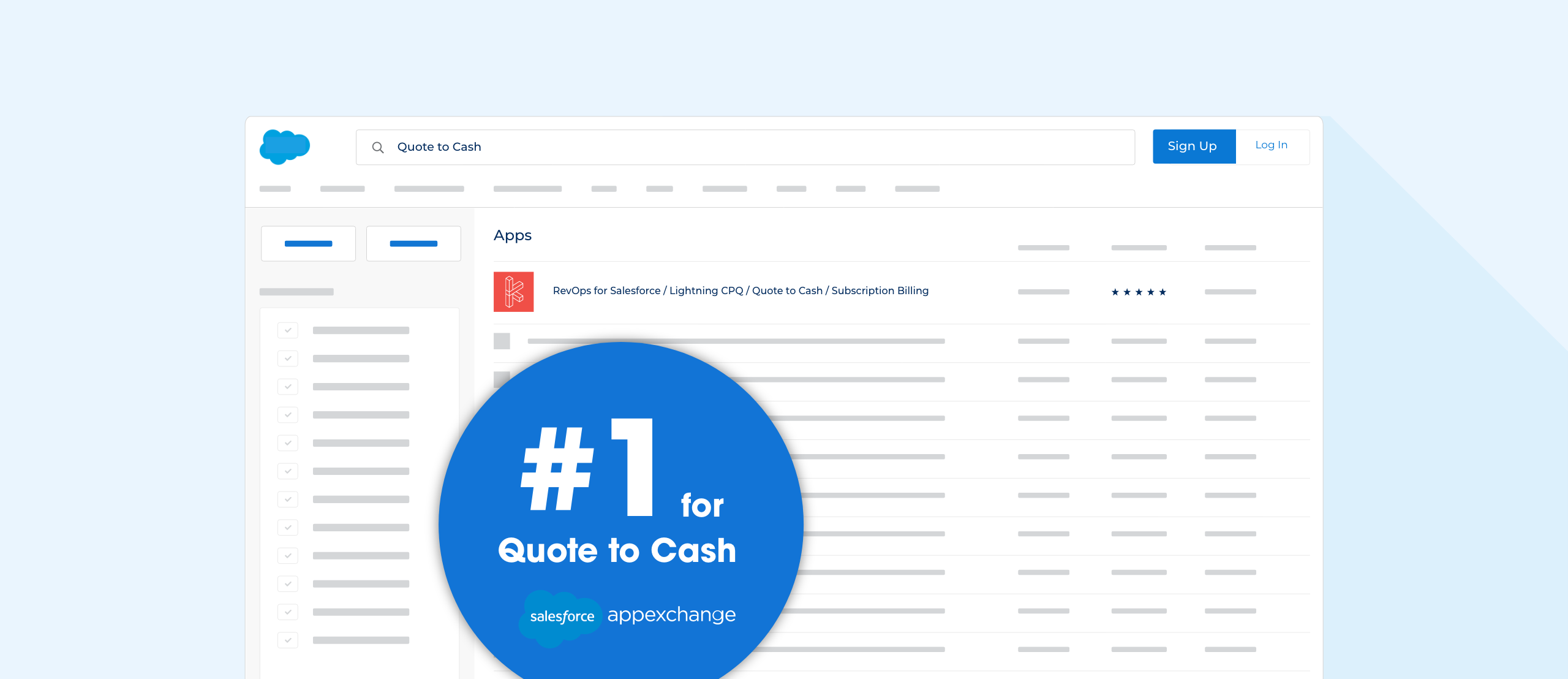
With a wildly successful RevOps app already in the marketplace, Kugamon wanted to level-up their offerings and needed a design to match their brand in style, substance, and flexibility.
Eager to differentiate themselves from competitor sites they saw as anemic and dated, the Kugamon team wanted to wow potential customers by supporting their claim that their products dominate the competition when it comes to customer experience.
With a bevy of new content around their product offerings, pricing, and customer testimonials, they wanted a CMS that would make continual content updates and curation simple. They also needed an option that would integrate seamlessly with their existing CRM and decided HubSpot checked all their boxes.

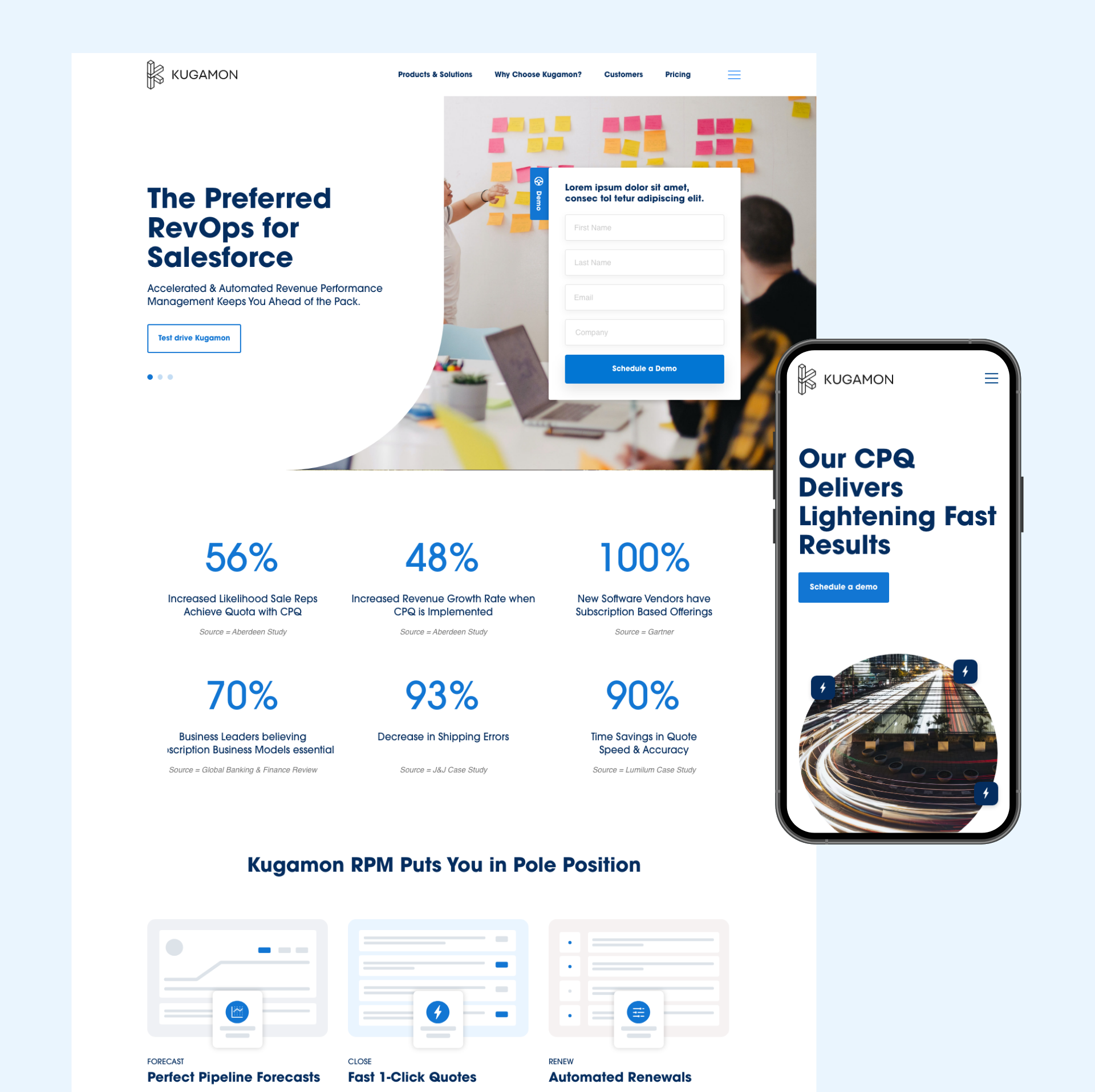
All that was left was to find an aesthetic that resonated with the team, paired with a user experience that would capture their potential customer’s interest, and lead them to test drive their apps. Our design team developed three design directions that pushed into distinct aspects of the Kugamon brand. Ultimately, the team pursued a direction that felt current, friendly, and engaging. The design uses simple graphics and easy-to-digest visual data representations to help their potential customers compare features while also getting a feel for what they can expect from the app itself.
With their successful launch behind them, Kugamon is continuing to explore their HubSpot CMS capabilities to tell their story through new front-end features that help them connect with their potential customers. Likewise, the DefinedLogic team is excited to see what is next for Kugamon and HubSpot so we can continue to grow alongside these exciting brands.
